I love logos.
They can convey so much meaning in such a small amount of space.
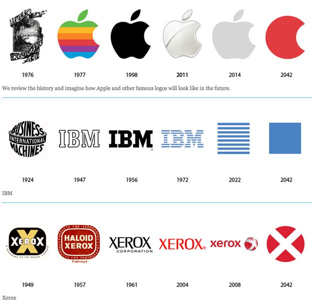
There seems to be a trend of logos becoming streamlined and simplified. Perhaps the longer a brand is established, the less details it needs to be recognized. Maybe our senses have become ever so inundated with information, logos are more impressionable with less details to commit to memory. Or maybe, it’s simply a trend and nothing more.
Here is an evolutionary look at some major corporate logos and their “proposed” future logo design:


Why do you think logos have become simpler?
[via BitRebels]
Eric Dye
Support Lead at Valet, and Proprietor of DYECASTING. Human by day, gamer at night, lover of coffee, and all things spicy.


Love this! I’m a logo nerd too.
I really like how Xerox will somehow become the X-Men. Can’t wait to see how that goes down. And seeing the Starbucks progression is hilarious! And the Motorolla line… priceless!
I’m in good company, then!
You Microsoft prediction almost came true 8 years early.
LOL! True story.
Microsoft have stolen my logo!!!! http://jpc-design.com/ I’ve been using my one for over 10 years – I want some compensation (just not a windows computer!)… 😉
They SO ripped you off!!! 😉