Andy Warhol 1928 – 1987 An American artist with a background in commercial art and illustration, this is apparent within his art work, especially as a leading figure in the art work for the Pop Art Movement.
Warhol explored the connection between celebrity, advertisements and artist expression, he was continually fascinated with a society in which people could be manufactured, made into a commodity and consumed like a product.
In his earlier work his brush work appeared more gestural, his piece ‘water heater’, which may have been influenced by abstract expressionism at the time.

Between late 1962 and early 1964 Warhol created his works primarily from screen printing of repetitive images, from photographs. By working in this technical way Warhol removed his personal touch as an artist, he often used assistants to support him in this process.
‘Green Disaster Ten Times’ 1963
Andy Warhol, Screen Print
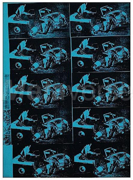
‘Green Disaster’ was part of a larger series of screen prints, Warhol explored tragedy that is experienced on a daily basis between the human race and the world of machines. Warhol wanted to bring this subject forward and reignite the contentious disasters as a conversation that should be had, Warhol felt that the public weren’t talking or acknowledging as they used to, the enormity of the collision between man and machine. Craving an emotional response from the public and viewers of his work.
The work looks like a visual pattern, I can’t help but think about decorative paper when I see a repeat pattern, using only two tones I don’t think helps this way of thinking when looking at the ‘Green Disaster’. However the image appears cold and uninviting, fitting for the subject.
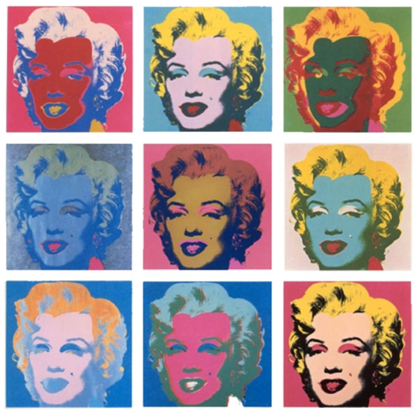
Here Warhol explores one of his Marilyn Monroe: a celebrity he continually worked with, in particular focus on her face and colour used to layer and expose. Here Warhol used the method of silk screening to produce multiple images within a grid of intensely bright colours, applied similar to that of the Fauves, such as Derain and Matisse.
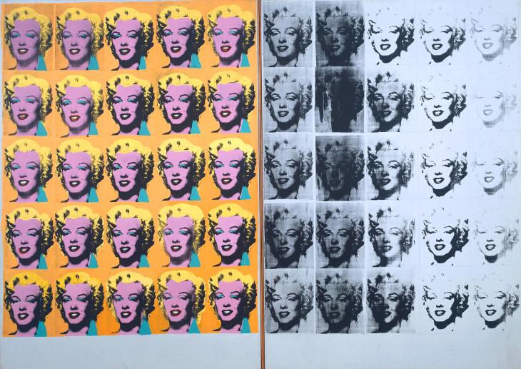
‘Marilyn Diptych’ 1962 http://www.tate.org.uk
Here Warhol has created more silk screens of Marilyn on based on the same photograph which he took from the film ‘Niagara.’ Warhol ultimately interested in the celebrity world, influence of consumerism and advertising and the similarities between the two and the influence on the public, the fascination of the celebrity world in which Warhol found Marilyn the ultimate connection between these worlds. To me this image is even more fascinating, she appears the same, however the image has been altered slightly, she becomes darker in places, until the colour fades, her face becomes increasingly blackened, is this the stage of her death? Eventually the face of Marilyn fades. Similar to my previous work of figures without faces or heads turned to give the impression of disappearing, losing identity. Is this how Warhol depicts Marilyn here? a vibrant figure, facing us head on and slowly fading out of the public eye?
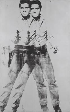
In ‘Double Elvis’ 1963, Warhol created a double vision effect by slightly overlapping 2 images of the famous singer. Warhol printed the singer on a silver background, this is fitting to the subject and reflects the glamour side to his life. Viewing on a computer screen the image appears grey scale, the figure is strong in stance which makes the overall image and shape interesting and effective.
Gilbert and George
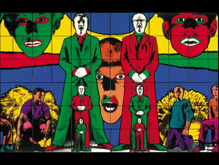
Gilbert (Proesch) and George (Passmore) are a duo, their work is known for its bright colours and photo, graphic style art work. Gilbert and George wanted to create ‘art for all’, they didn’t want to work within the confines of art which can separate the viewers towards work, they referred to their art work as sculptures regardless of the medium used e.g charcoal and paper sculptures.
Within their work Gilbert and George portrait the city, this is an ongoing theme alongside other elements which make up our lives today. Viewing the work of the duo I can see that they are not afraid to startle, in terms of imagery and text used, some of which could be offensive. They give a harsh and direct message to the public through their work.

‘OAP’ 2011

‘LIFE’ 1984
“Our subject matter is the world. It is pain. Just to hear the world turning is pain, isn’t it. Totally, every day, every second. Our inspiration is all those people alive on the planet, the desert, the jungle, the cities. We are interested in the human person, the complexity of life.” Gilbert and George whitecube.com
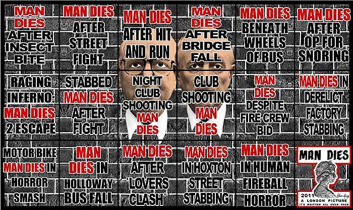
This piece was inspired by crime headlines from London newspapers. They used more than 3,000 British newspaper posters to create the pictures, many of them they stole.
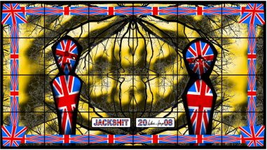
Their postcard multi images developed into much more patterned, decorative and patriotic sculptures, which appeared very kitsch, images you would expect to find in a tourist shop on mugs and coasters.
I find Gilbert and Georges inspiration interesting and their way of thinking – ‘art for all’, the work is in your face, blatant in terms of message, however the finished work does not capture me artistically, only informatively.
