Mozilla designers are looking to redesign the Firefox logo, and they have asked the browser's fanbase for feedback.
"As an icon, that fast fox with a flaming tail doesn’t offer enough design tools to represent this entire product family," Mozilla says. "Recoloring that logo or dissecting the fox could only take us so far. We needed to start from a new place."
Mozilla wants to get rid of the fox after it axed the dinosaur
To do so, Mozilla plans to give the Firefox logo a fresh new facelift, just like it gave the old Mozilla dinosaur logo a new look last fall when it replaced it with a new wordmark-style logo after a seven-month search.
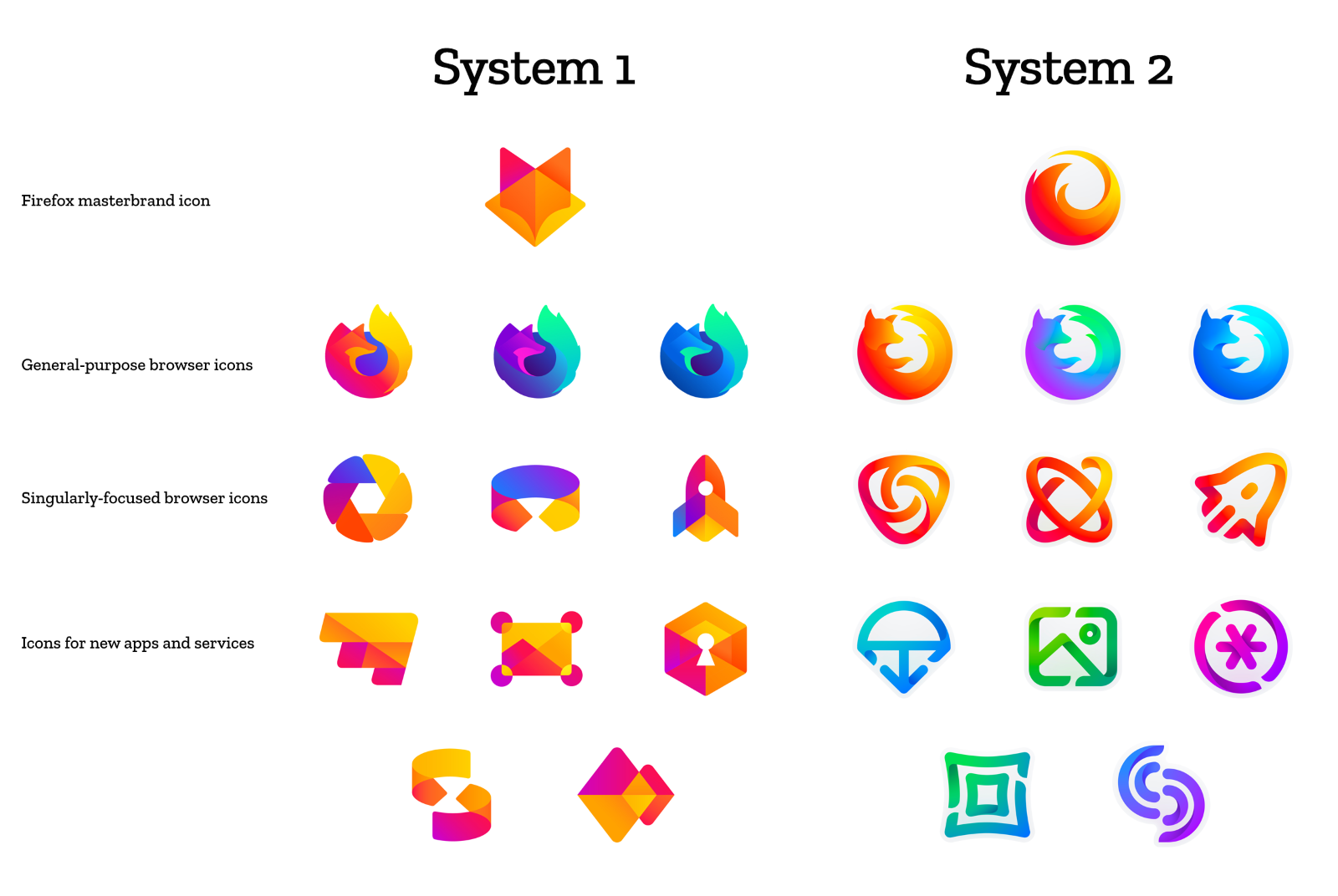
Now, Mozilla has posted two new rebrand ideas for the Firefox brand, named System 1 and System 2.
These two rebrand proposals include a new Firefox logo, new icons for the three main browsers (Stable, Nightly, and Developer), new icons for its niche browsers (Focus, Reality, and Rocket), but also a generic style for logos for upcoming projects.
Mozilla designers say these are not final versions, and tweaks will be made to the current proposals. The design team plans to draw out the process and arrive at a rebrand that everyone likes, just like it did with the Mozilla Foundation logo rebrand.
They are now asking users to post their opinions about the two proposals as comments on this blog post. Designers said they're interested in answers to basic questions, such as:
— How visually cohesive is each of them? Does each hold together?
— Can the design logic of these systems stretch to embrace new products in the future?
— Do these systems reinforce the speed, safety, reliability, wit, and innovation that Firefox stands for?
— Do these systems suggest our position as a tech company that puts people over profit?
"With your input, we’ll have a final system that will make a Firefox product recognizable out in the world even if a fox is nowhere in sight," Mozilla said.


Comments
BeckoningChasm - 5 years ago
I like some from both sets, but some of them are confusing. And some are really unattractive.
Mr.Tom - 5 years ago
System 1 seems more cohesive. I like the main top logo, sill looks like a fox, and almost all the others look like they belong in the same family.
KattyandMe - 5 years ago
Here, at last, they are making rebranding! I like System 1 because of its forms and lines. Remember I was making something like that but failed. I used logomaker https://www.logaster.com/logo/ and got what I wanted. It was really good emblem.