Behind the feature: Find and replace


Designer Jackie Chui on the complexities of sorting logic, designing specialized UIs for Figma and FigJam, and why experimentation and intuition go hand in hand.
Hero illustration by Martina Paukova.
When we first started working on find and replace, I assumed it would be straightforward. After all, I had already built a plugin of the same name back in 2019. How hard would it be to add a search bar and highlight stuff on a page? I learned quickly that a seemingly small feature can uncover a tangled web of engineering and design challenges—from sorting search results, to designing specialized UIs. Now that find and replace is live in Figma and FigJam, we wanted to share a behind-the-scenes look at those challenges, our approach to testing, and how we translated learnings from the plugin to build a native functionality.
Building intuitively
We knew that most of the work on find and replace would be focused on building an intuitive "find" experience, so before we even scoped the feature, we ran a brainstorm with the design team. We gathered some ideas and opinions on what makes a great search experience, and began building out a cross-functional working group that included engineering, product management, UX writing, and product marketing.

We then defined a few high-level principles for how we'd want search to feel in both Figma and FigJam:
- Fast and lightweight
- Smooth, especially when navigating across the canvas
- Familiar to searching in other apps (e.g. browsers)
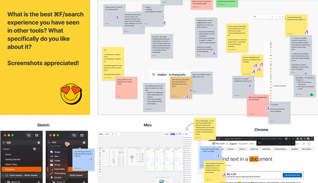
Search is one of those features that's tough to get a feel for without trying it out on real files. I leveraged my plugin development skills to build a prototype that simulated part of the search experience, allowing us to experiment with different ideas early on. From there, the engineering team continuously built and iterated on designs throughout the process so we could get to the right solution faster. As we experimented with different approaches, we relied on Figmates to use it in their daily work, share in-depth feedback, and participate in bug bashes.
Getting the core experience right
We decided to solve find and replace in FigJam first. This allowed us to focus on the core experience—finding text in a file and navigating through all the matches—before expanding to support more object types and levels of complexity that are typical to Figma files.
Sorting out sorting logic
Building search in Figma and FigJam presents unique challenges. Content in Figma and FigJam is multi-directional and multi-dimensional. The canvas doesn't flow from top-to-bottom like a web page or text document; it has a user-defined structure that we need to be able to predict so that ordering makes sense no matter which type of file you're in. We tackled this challenge incrementally.
Building on top of existing logic
First, we needed to develop logic for grouping and sorting results found on the page, focusing on where to start and the order in which to navigate. If we didn't get this right, the search could feel jumpy and leap across the canvas between multiple matches. Our first attempt built on top of existing sorting logic used by our prototyping engine, which automatically sorts objects row by row. (If you've ever created a presentation deck in Figma, you may notice that the slides are automatically sorted in this way.) While this logic works reasonably well for neatly organized objects like slide decks, we soon realized that it wasn't as reliable when dealing with pages that have stickies and shapes scattered all over the canvas.
Leveraging sections
Once we introduced sections in FigJam, the files became more structured and we were able to sort the content one section at a time, thus making the sort order feel more natural to the visual groupings on the page. After analyzing how teams use FigJam, we found that they often group stickies together during brainstorming to pull out key themes and align on next steps. Sometimes stickies overlap to create “threads” of replies to an idea. Brian, one of the engineers on the project, implemented a spatial sorting algorithm that groups elements by proximity, allowing us to surface logical groups of results when they're not organized within sections.
Forming heuristics

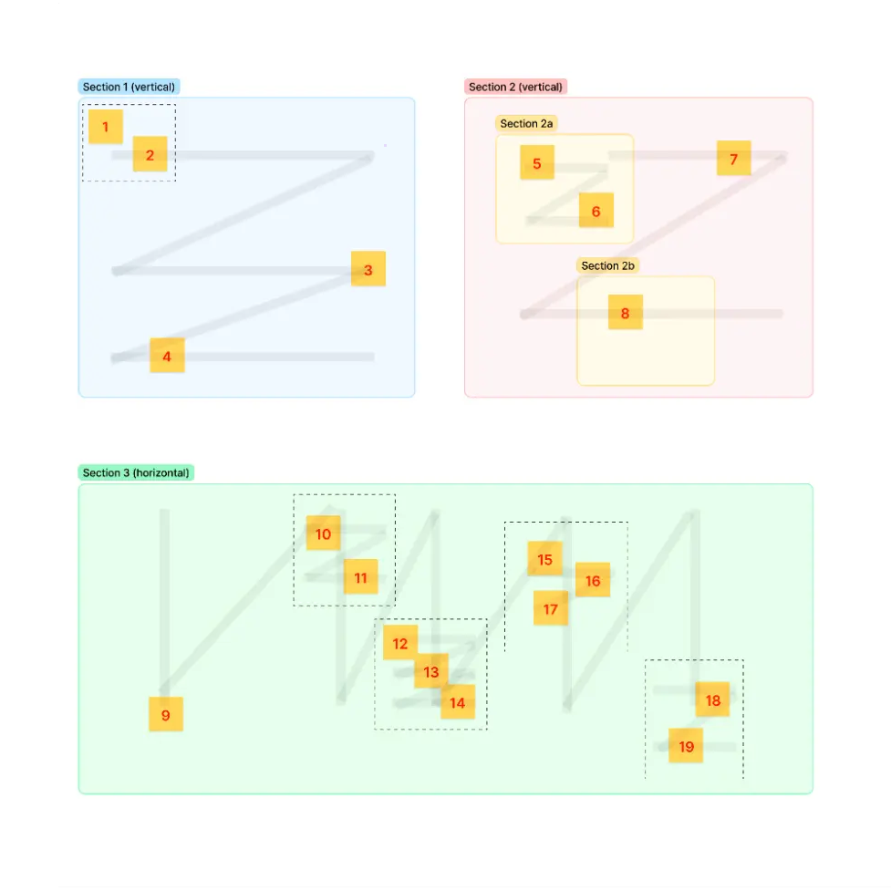
We mapped out heuristics about how section shapes influence the sort direction
As we tested our approach, we also noticed that users tend to post stickies from left-to-right in tall sections, and top-to-bottom in wide sections. From there, we formed heuristics around how the shapes of sections would influence the sort direction (among many other nuances) to make traversal feel natural.
Zooming and panning
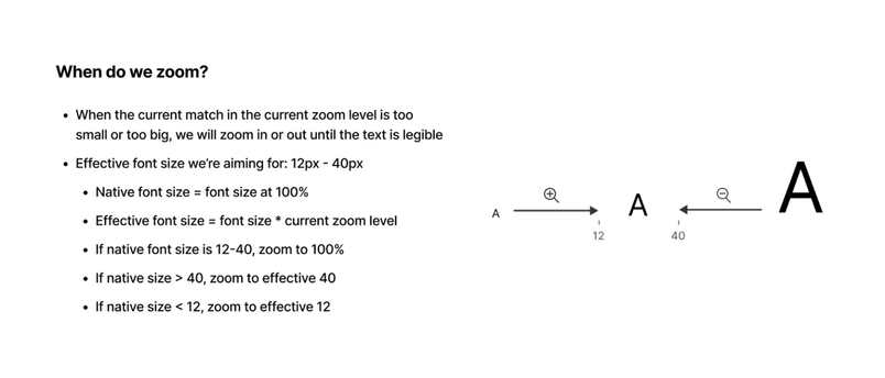
When someone searches for a word on the canvas, the canvas automatically zooms into the active match to give it focus. Zooming to 100% usually puts text results in an optimal viewing size. But some text can also appear gigantic or tiny, so we defined an acceptable range of "effective font size" (font size * zoom level) to determine if they need to be zoomed in or out to become legible.

When there are multiple results in the same view, we avoid panning to each result to minimize unnecessary movement. However, this also makes results near the edges of the screen harder to see. So, we decided to outline an invisible box in the center and only pan when a match falls outside of it.
Going beyond text in Figma
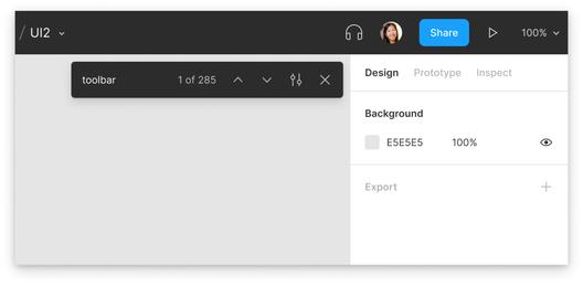
While FigJam's search was designed for simplicity, we wanted Figma's search to be powerful. Instead of the one large canvas in FigJam, Figma files can contain nearly infinite pages. Plus, we knew that we needed to support search for frames, pages, components, and other layers, compared to the simpler text search in FigJam.
We identified three primary use cases for find and replace in Figma:
- Text search
- Quick navigation to pages and top-level frames
- Layer name search
We wanted the search experience between Figma and FigJam to feel consistent and familiar, so we began exploring variations of the floating search bar on the canvas vs. in the sidebar. FigJam’s floating search bar is lightweight and works very well for searching text, but it falls short on layer name matches—a critical use case in Figma. (Imagine having to get through hundreds of mixed results before arriving at a component or frame you're looking for!) On the other hand, the sidebar was better at showing layer name matches, but felt much heavier than the floating search bar, and it wasn't obvious how we'd combine text and layer results harmoniously.

I spent weeks exploring variations, including a few hybrid designs incorporating both surfaces. Still, nothing felt particularly great.
This was one of the toughest problems I encountered. Rather than trying to solve it alone, I decided to present my ideas in design critiques to get input from the rest of the team. It was a complex problem with lots of feedback and differing opinions.

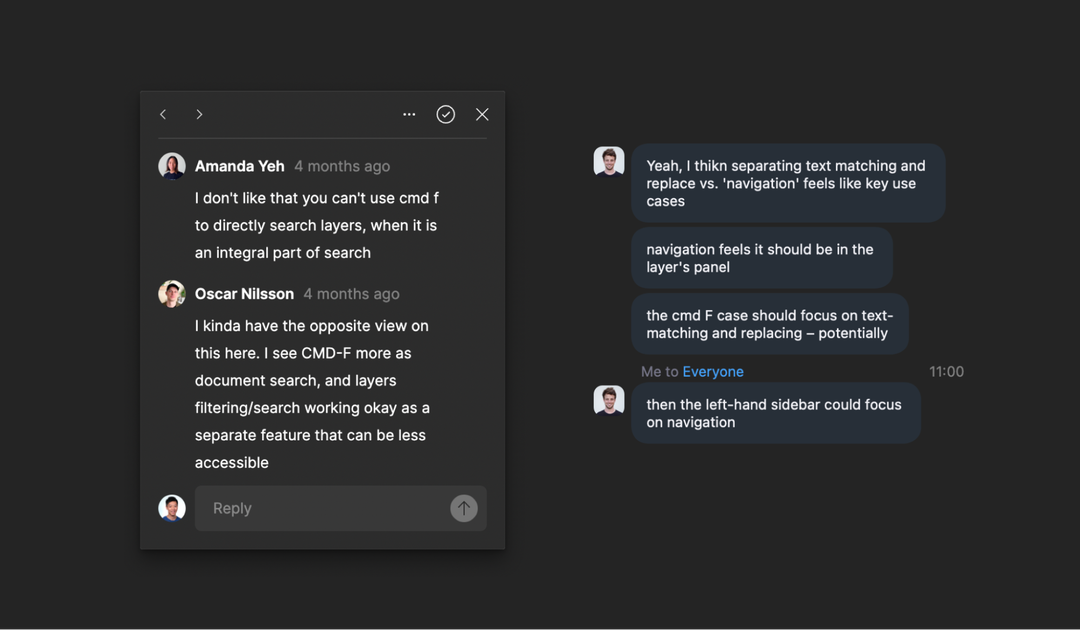
I regrouped with our Product Manager KC to prioritize goals for find and replace, analyze our options, and find a path forward. We realized that our top priorities—layer and page search—were better addressed by having a search bar in the layers pane alone. It was more important to design an optimal layer search experience than to be completely consistent with the experience in FigJam. We removed the floating search bar and tried to incorporate text results in the layers pane, so everything would fit together nicely.
Details and reflections
There are endless details we could’ve spent time on. Here are just a couple examples of decisions we made and how we got there.
Designing shortcuts
Search is a keyboard-heavy feature, from pressing ⌘F to typing in a query and navigating between results. Designing a set of shortcuts that feel intuitive was a top priority, and also one of the most challenging to get right.
One interesting observation from our internal testing was that some users coming from FigJam instinctively pressed Enter out of habit to step through matches in Figma.

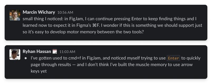
The obvious answer was to support Enter = next as users expect. But there was a lot to consider.
- When you search for a page with
⌘F, Enter should navigate to the page - If we supported
Enter= next on text/layers, butEnter= navigate on pages, that would create an inconsistency - If we changed
Enter= next on pages, we would need another way to navigate to them - If we didn't support
Enter= next in Figma, that would be inconsistent with FigJam and fail users’ motor memory - If we removed
Enter= next altogether in both products, that might not meet the expectations of users coming from other search tools
After prototyping and iterating, my instinct was to keep Enter = next for text/layers, and Enter = navigate on pages.
Learning from the plugin
Being able to apply learnings from building the plugin to designing and developing a native feature was incredibly instructive. We didn't just copy the plugin UI and call it a day; we used it as an opportunity to review a successful plugin design and make improvements.
For example, I learned that after replacing a word, the canvas should wait for a little bit before jumping to the next word. This ensures the user is able to visually see the success state of their replacement before moving on.
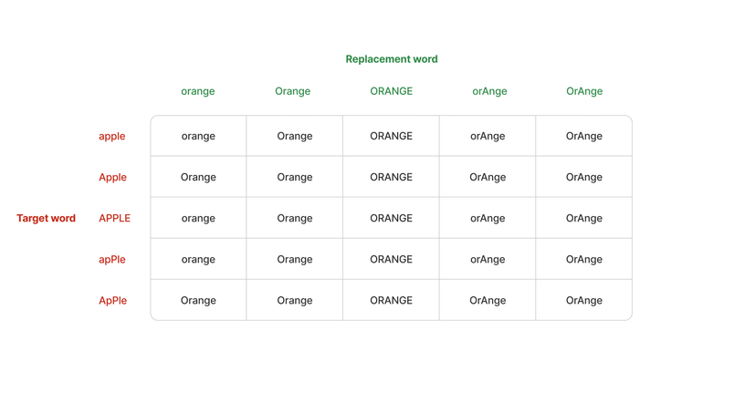
The "Keep original case" setting in the plugin allowed you to preserve casing from the target word. By adopting smarter rules that cover most common cases, we were able to remove the setting altogether in the new design. That's one less thing users will have to worry about. It may seem small, but those small details add up to a big improvement in the user experience.

Above all, I've learned that everything comes with its own set of tradeoffs, and that there are no perfect answers for even the most (seemingly) straightforward questions. Ultimately, each decision we made was a mix of experimentation and intuition shaped by months of hard work across product, engineering, and design.
Many thanks to the working group at Figma—Product Manager KC Oh, engineers Molly Lloyd, Brian Schlenker, and Akshay Subramaniam, UX writer Ryan Reid, and marketer Sula Yang— for making this possible, and to all of you in the community for trying it out! You can learn more about find and replace here.
Related articles